Connecting TransUnion's business solutions into a shared singular experience
Coined and developed the unified experience solution and led the creation of a design system for a large financial institution—aligning their products and solutions into one cohesive digital ecosystem.
- Company
- TransUnion (Consulting)
- Role
- Lead UX Designer
- Tools
- Figma, Storybook, Github
Overview
TransUnion's business portfolio brings together a wide range of solutions designed to help organizations solve complex business needs—from marketing and fraud prevention to credit, analytics, investigations, and consumer engagement.
Together with a team of developers and two other designers, we were asked to step back and assess how TransUnion's growing portfolio of Tru™ products could feel genuinely interconnected—not just in strategy, but in the way each experience was designed and built.
Problem
With its rapid growth across its Tru™ portfolio of business solutions, multiple teams built products without sufficient communication or strategy. As a result, the products felt separate and disconnected.
This created a challenge: how to turn them into an interconnected ecosystem that's consistent in both look and feel—and in the overall experience.
Solution
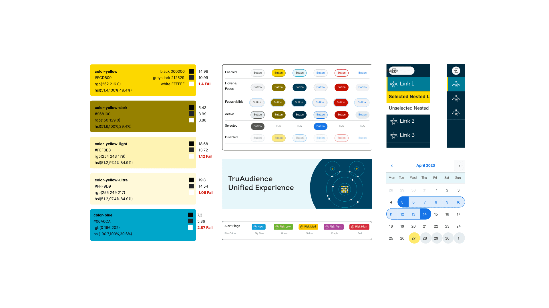
After a series of interviews with key stakeholders, I realized they needed a single source of truth—a way to translate “ecosystem thinking” into concrete design and implementation decisions. A comprehensive collection of foundational building blocks, reusable components, standards, and guidelines that helps teams build consistent digital products that can scale across teams.
That's when the missing piece clicked. I pitched the vision, rallied the teams, and championed TransUnion's first-ever Design System.
Approach
Using the TruAudience app as the initial baseline, we collected samples of UI elements and captured every element visible on each page.
We documented everything in a spreadsheet to track how each type of UI element appeared on a page and the many variations it had.
The audit results revealed the following:
- Some UI elements are interpreted in different ways visually throughout the app
- Way too many UI elements; two different UI elements were being used to accomplish the same job.
- Lack of accessibility
- No spacing system in place
After talking with designers, developers, and stakeholders we defined what the unified experience should look and feel. Established design-system goals, principles and guidelines. Then from there, we created a roadmap on how to execute the vision.
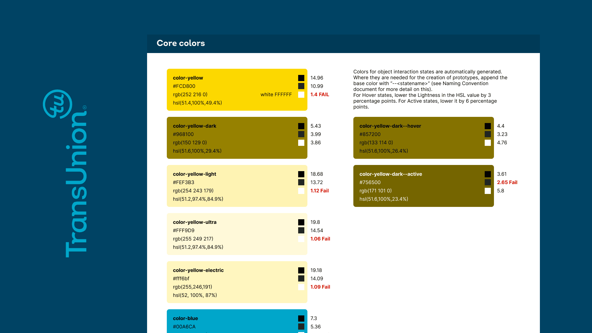
We then curated the underlying design language that became our north star:
- Typography
- Color
- Spacing
- Grid/layout
- Elevation
- Border radius
- Iconography
- Accessibility standards
- Design tokens
Once we have the final list of components, we then started writing design specifications for each of the UI elements that we have decided to add in the design system.
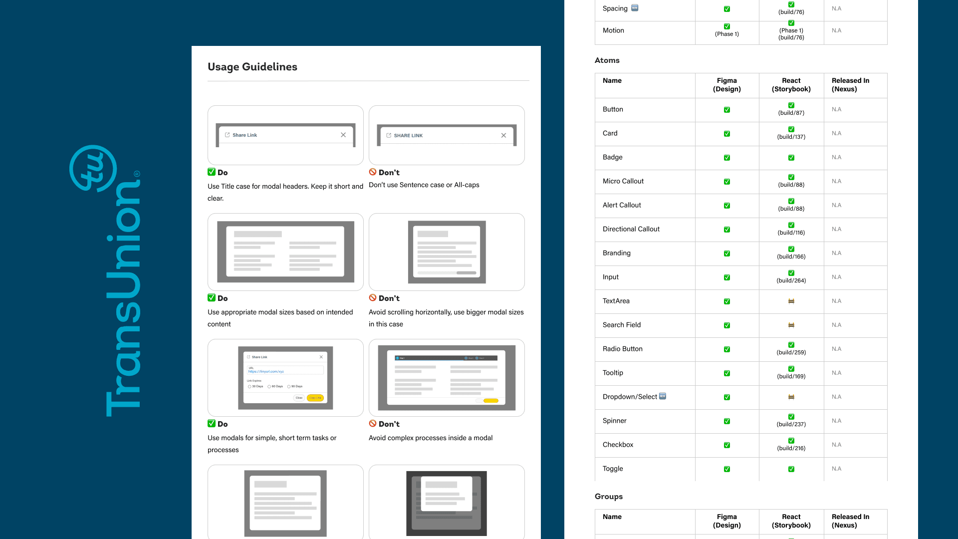
We have identified the following categories based on the Atomic Design Methodology:
- Sub-atoms
- Atoms
- Components
- Groupings
- Templates
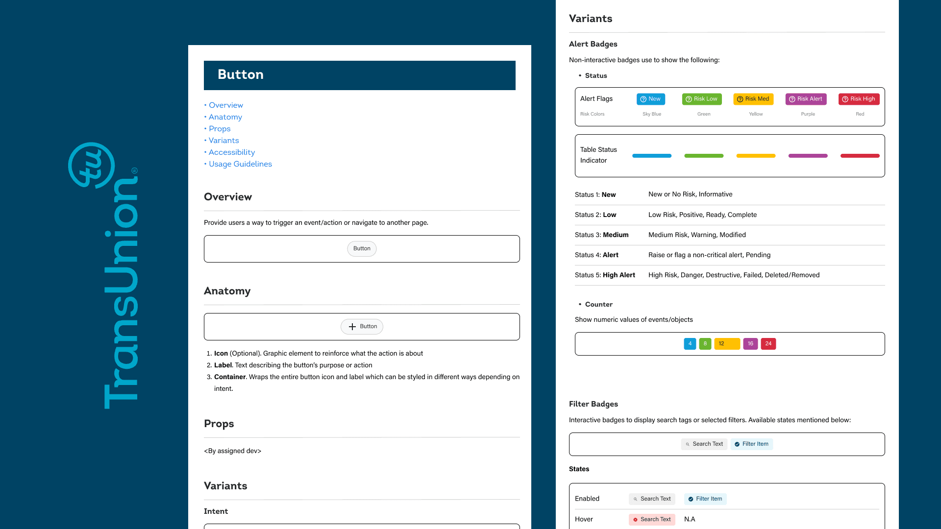
Each specification details all information related to that said component from implementation, usage guidelines and accessibility.
See sample documentI recognized that creating a design system required more than building a Figma library—it required cross-functional alignment and shared ownership. I worked closely with UX and product designers and developers to establish common patterns, standards, and guidelines. Together, we reviewed, created shared documentation and a clear path from design → development → product.
With my coding background, I was also heavily involved in reviewing code to ensure designs are implemented and released at the highest quality.
Prototype
Insights
- Design systems are more than UI libraries; they’re living, evolving products that grow over time.
- A successful design system is one that considers governance and adoption to be as essential as the library itself.
- By launching the design system with a single product team that was fully bought in, we created a controlled environment to prove value quickly. The early success built trust, generated internal momentum, and turned adoption into a pull from other teams.