Action Dashboard for Attorneys & Paralegals for CasePacer
Owned research, putting together requirements and design of the newly released user dashboard – solving a long time problem in the existing user workflow.
- Company
- CasePacer
- Role
- Senior UX Design
- Tools
- Figma
Overview
After joining CasePacer—their legal case management platform for personal injury and mass tort—more than 10 firms were already supported, with a user base of around 200, mostly attorneys and paralegals handling hundreds of thousands of cases.
Right after logging in, the platform is organized into several key pages:
Cases • Tasks • Contacts • Calendar
As the cases added grew, those pages became increasingly data-heavy, turning key screens into long, bloated tables that were slow to scan and harder to act on. The Calendar also became difficult to manage—when dozens (or hundreds) of case and firm-wide dates stacked up, important deadlines were easy to miss and users spent more time filtering and hunting than planning.
This was a clear opportunity to shift the product from “a set of big tables” to a guided, productivity-first landing experience—one that helps legal teams immediately understand what’s urgent, what changed, and what to do next.
That’s where I came in. I joined CasePacer as the Senior UX Designer and was tasked with identifying the missing piece in the post-login workflow and shaping a direction that improved two outcomes the CEO cared most about:
- Productivity
- Visibility
Problem
For a long time, the platform’s index pages were treated as the default landing experience—essentially a set of large tables where users were expected to “find what to do next” on their own.
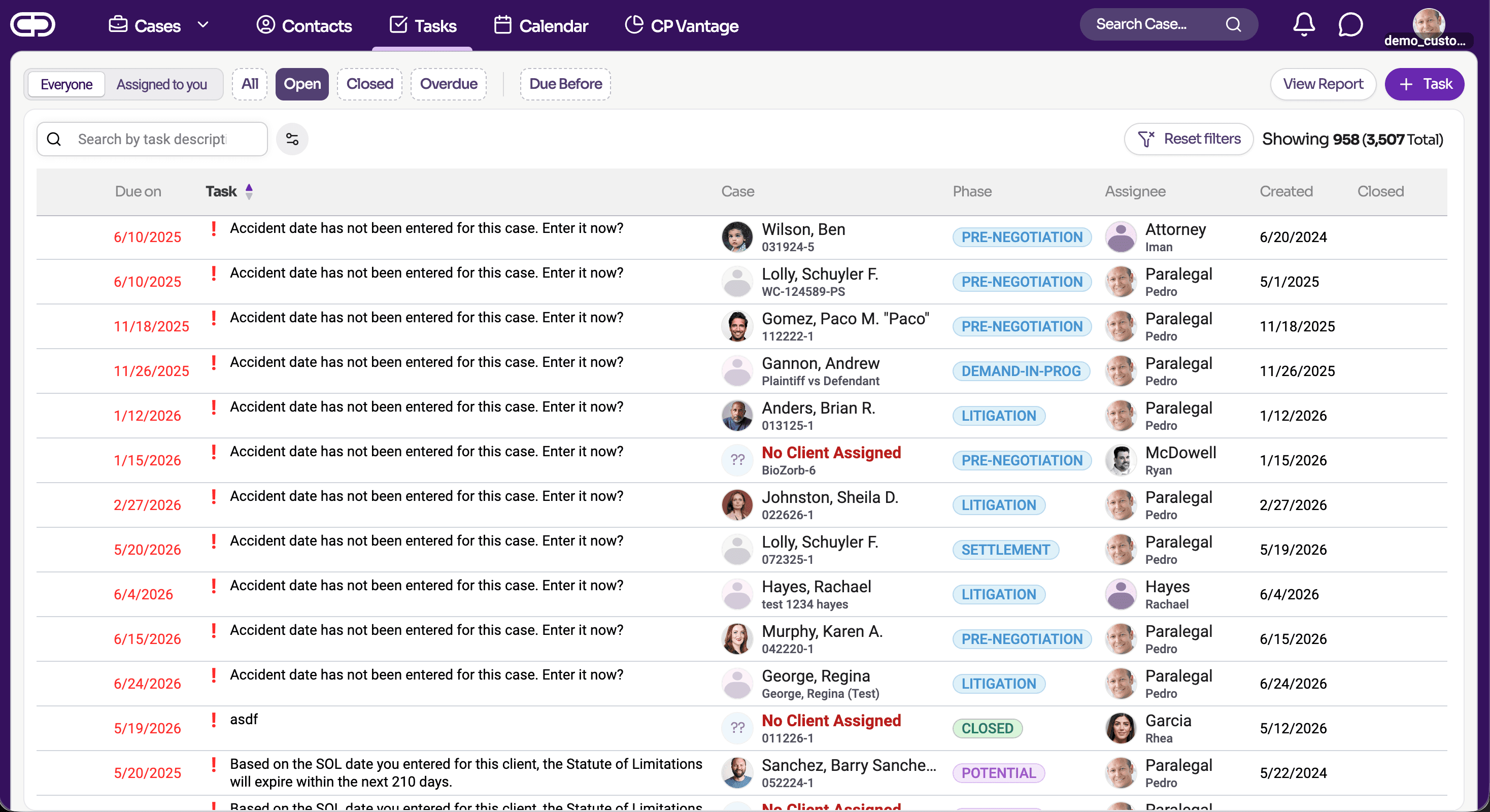
But as caseloads grew, those tables became so dense that they stopped functioning as guidance. Instead of surfacing priorities it just felt like a data dump, they forced attorneys and paralegals to scan, filter, and cross-reference rows just to understand which cases needed attention and what the next action should be.
Work that should have been obvious—what’s urgent, what’s blocked, what changed—was buried in noise. The system became another task to manage, rather than a tool that proactively helps teams move their assigned cases forward.
Solution
Design an action-based dashboard that gives users a clear picture — what’s urgent, what’s changed, and what needs attention—without forcing them to dig through massive tables.
The dashboard is made up of focused widgets and visualizations. Each one explores the underlying data in the Cases, Tasks, and Calendar tables and extracts the key signals (e.g., upcoming deadlines, overdue tasks). Instead of presenting every row, these components summarize, filter, and highlight what matters most so users can understand priorities and take action at a glance.
It’s an entirely new page that becomes the default landing experience before users navigate into the rest of the platform’s core pages.
Approach
Leadership was eager to start shaping the feature right away—prioritizing fast iteration in production over a longer upfront research phase—so we could learn from real usage, validate assumptions quickly, and continuously refine the experience as we go:
With the help of our Product Owner, a subject matter expert whose prior experience as a paralegal helped ground the work in real-world needs.
This step revealed the following insights:
- Determining the appropriate dashboard type is important
- Must be highly visual and dynamic
- Inject hints of gamification strategy to boost user engagement and motivation
Shaping the feature meant working closely with the product owner and the development team, doing multiple design reviews and feasibility sessions respectively.
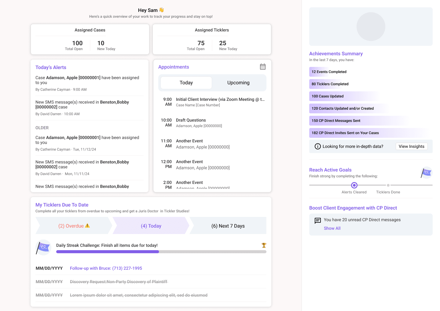
Once we had a working prototype and feasibility had been approved by development, I scheduled a demo with the executive team to ensure alignment with business needs.
After everything was approved, I collaborated with development on implementation. With my coding background, I worked closely with the team to give precise feedback and communicate gaps the prototype couldn’t articulate, highlighting UI issues directly and helping accelerate delivery.
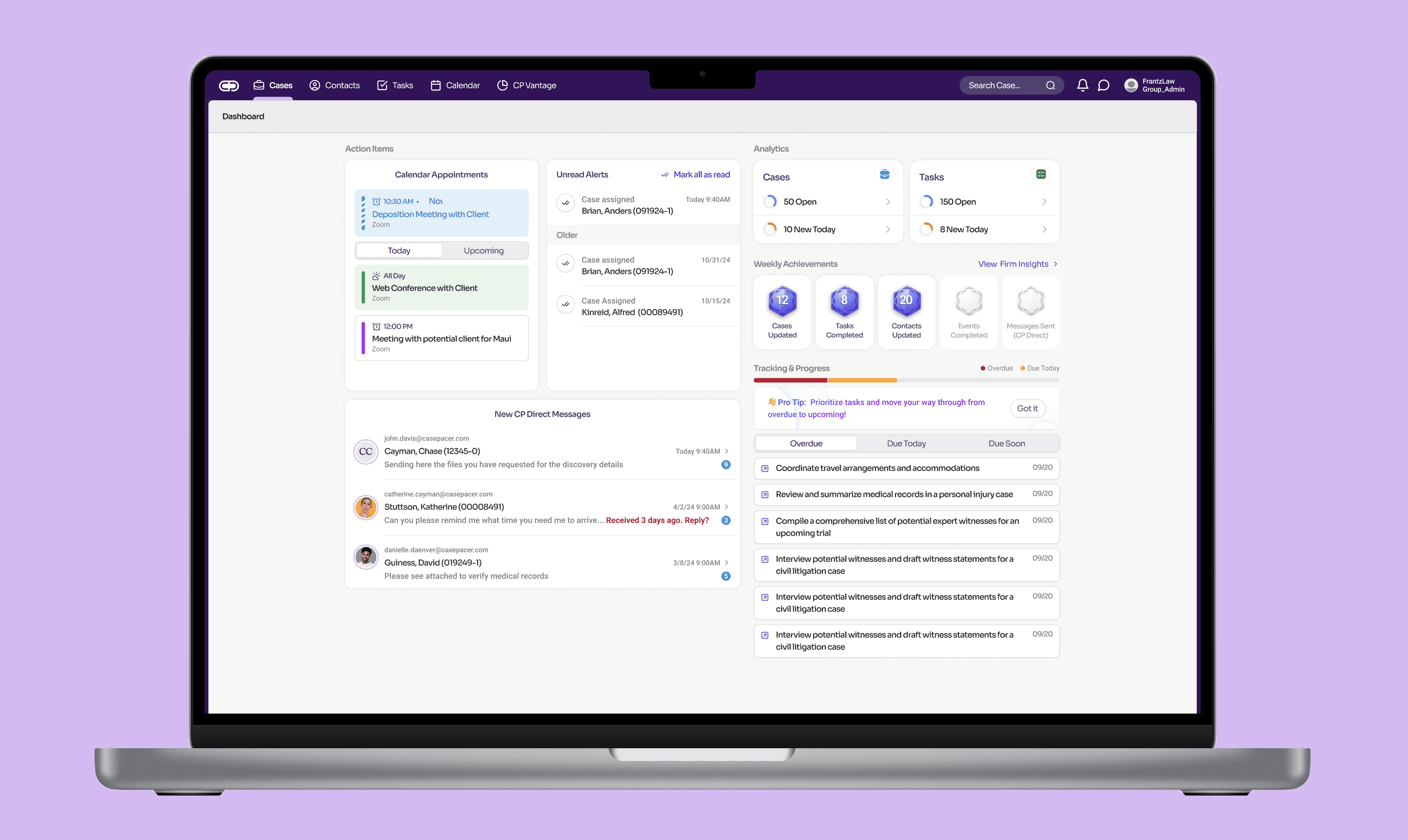
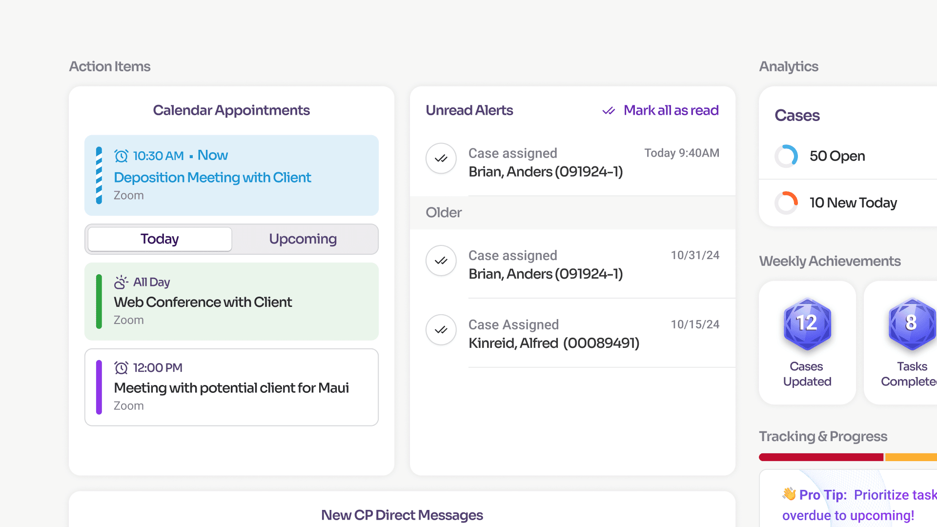
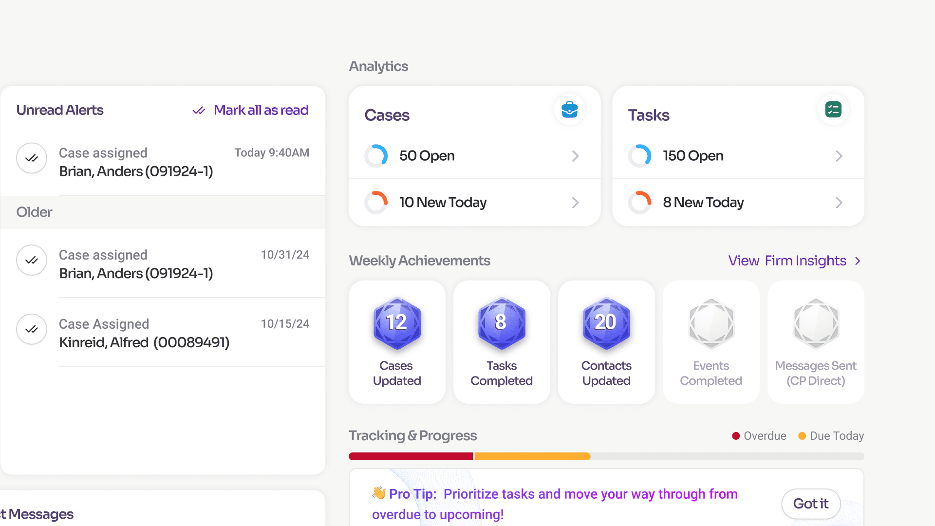
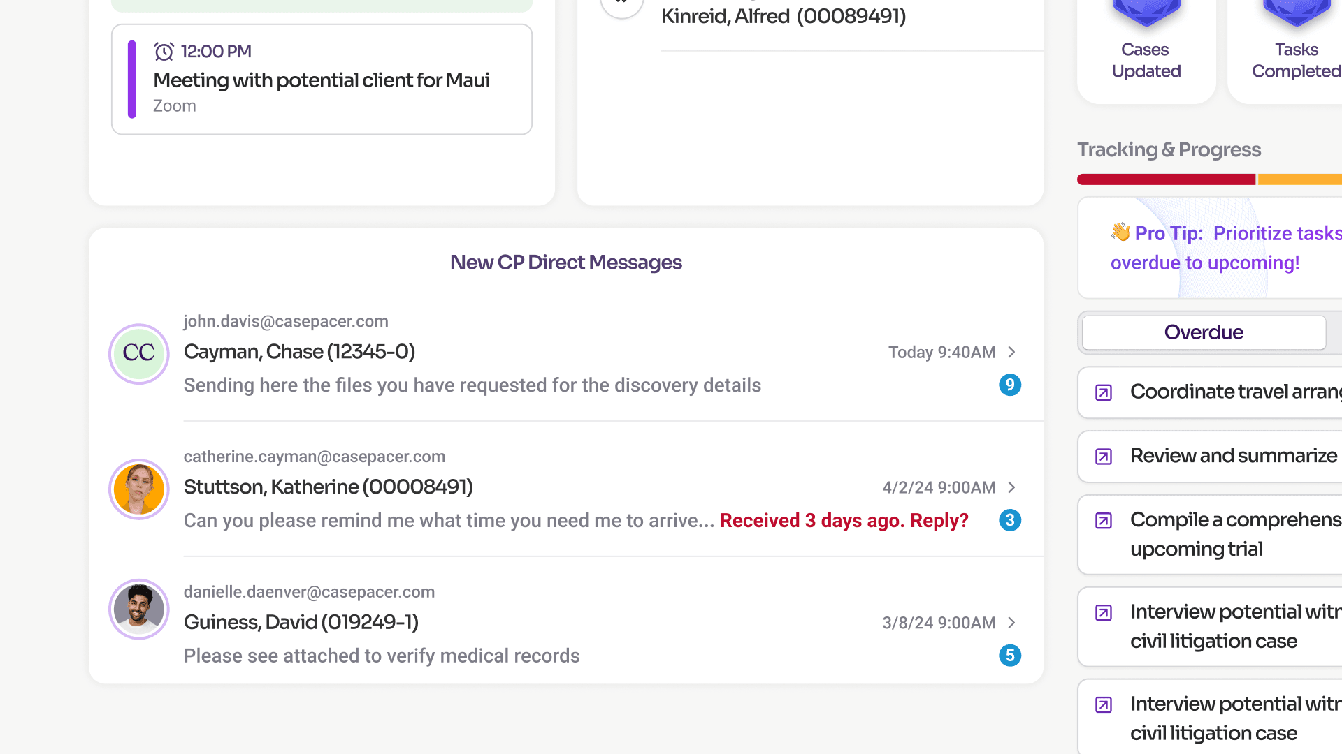
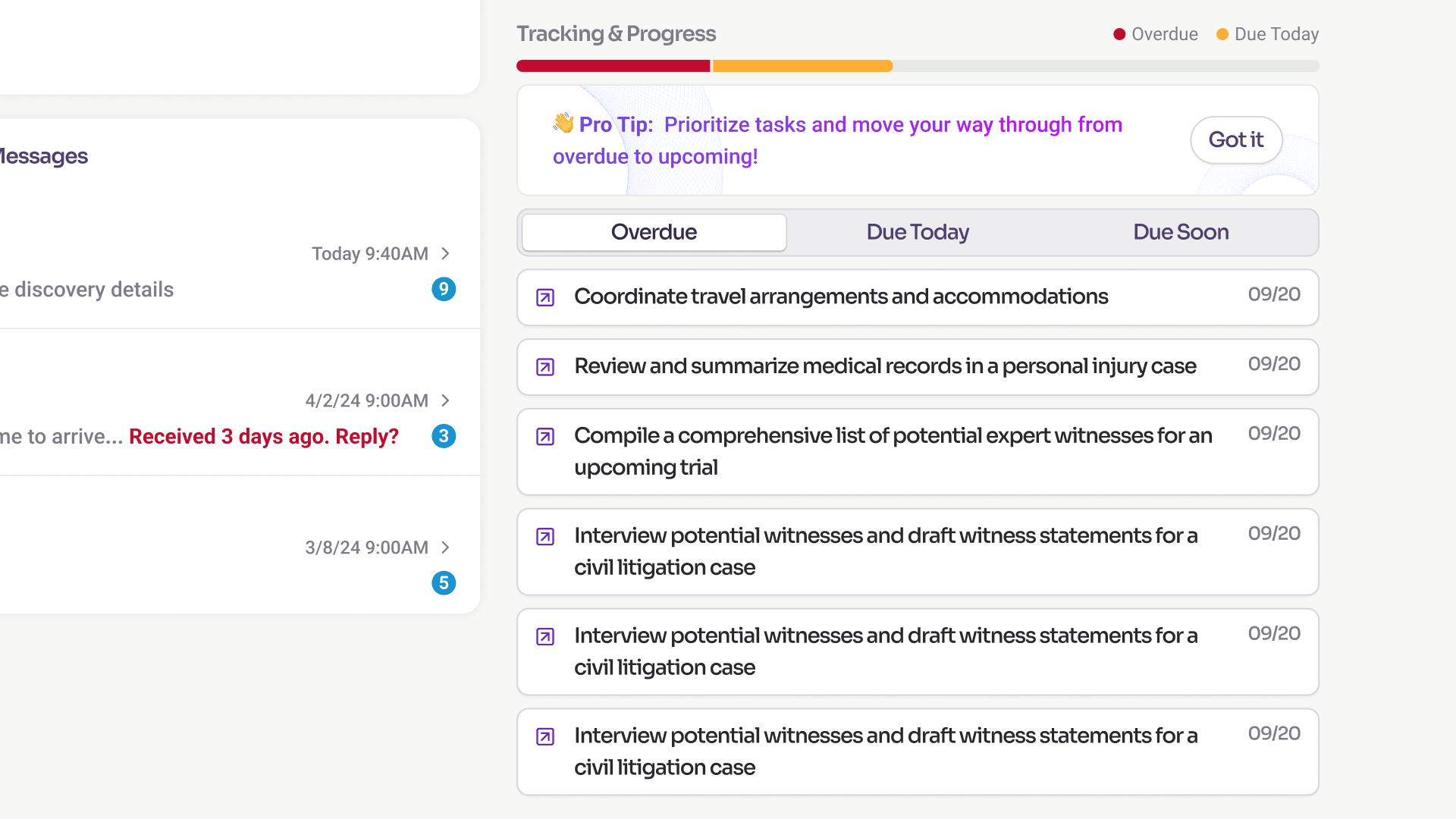
I landed on an action-based dashboard composed of various widgets, grouped into specific categories, each with specific goals in mind:
- Action Items: What requires the user’s immediate attention?
- Analytics (including Weekly Achievements): Show aggregate data in a meaningful way
- Tracking & Progress: Assist users in prioritizing their work so they immediately know what to handle first—and what can wait—in a systematic, step-by-step workflow.
Key Design Decisions
Nudges in messages
A small UX feature I added to messages is a set of prompts and reminders—timely interventions when a message hasn’t received a reply for a certain period of time. This helps ensure firm clients’ needs are addressed promptly, improving client service satisfaction.
Widget order
Following the natural direction for tracking text from left to right, I intentionally placed the widgets that require the highest urgency at the left. I wanted users to immediately see what they needed to review or take care of, starting with appointments—because missing a case-related meeting can have a major impact.
Weekly Achievement Badges
Gamified elements that create in-app challenges for motivation and reward work milestones.
Insights
- Regularly audit existing workflows; longevity doesn’t equal effectiveness especially for high traffic areas
- Expanding the dashboard feature not only at a user level but also to a case level might prove to be powerful in seeing the big picture at a glance